Insights falling into a broader, general category.

Oil and water do not mix!

They are said to be immiscible. You can temporarily mix the two if you put the two liquids in one container and give it a rather vigorous shake. However, after a while, the two will once again separate.

Fundamental and quant investors are also immiscible. Just like their liquid analogues, these two groups of professionals are in some ways similar but mostly different and don’t mix well. That vigorous shake, in investment organizational terms, can be either a strong incentive to collaborate, perhaps combined with a structure or a process which makes the two strongly interdependent. Over the intermediate to long term, however, nature will prevail and two groups come apart and/or one of them disappears.

The question you might ask yourself is why does that happen and how can we overcome that?

There are a number of reasons the two groups of investors don’t mix. People working in these companies usually come from different educational backgrounds (quants learn math and engineering and take a top-down approach to investment decision making that starts with a vast quantity of market data; fundamental investors (aka quals) study economics and learn a bottom-up investment process that seeks to identify the future value of a single stock). Quants and quals have different personalities, speak different professional languages (acronyms), look at the world in a different way and use completely different processes. The outcome of their work, their portfolios, look very different and (perhaps most importantly) clients will put them in completely separate boxes and treat them differently.

If you were to strike up a watercooler conversation about their positioning, they would also be quite different. A fundamental investor is very likely to know why a company exists, how it makes money, have an outlook for its business and industry (presumably different from what is already priced into the shares), have had numerous meetings with its management team, competition, certain large customers and regulators, where relevant. A quantitative investor will frequently not know much beyond the ticker of the company but instead be well aware of the types of factors the portfolio is exposed to and very little beyond that. Don’t be surprised if they don’t know what the company actually does or whether it’s expected to be free cash flow positive over the next few years.

Now, suppose that conversation is not by the watercooler but after a few drinks, following a period of bad performance in client portfolios. Necessitating some explanation and attribution, fundamental investors would say quants are a bunch of geeks who don’t understand how the world works; quants would describe fundamentalists are a bunch of overpaid idiots.

An interdisciplinary approach in bringing quantitative tools to fundamental management is a tremendous opportunity. Such a differentiated approach allows for delivery of superior returns which are not correlated with quantitative strategies. At the same time, the process is highly repeatable and scalable, does not have behavioural biases, and is transparent.

Using an innovative, differentiated approach means we will have to continue explaining to our potential clients about how this process ends up giving them potential upside to their portfolios and investment returns. So, just like understanding the chemical properties of an emulsifier in keeping oil and water together, it takes a bit of patience and reading up to understand how this process can bring the best of both worlds from fundamental and quant.

“The soul never thinks without a picture”

We all know the age-old expression “a picture is worth a thousand words” but let’s see if it still holds up in today’s world!


I am guessing you are most likely reading this on a smartphone phone screen. Apple’s iPhone 13 has a resolution of 2532×1170 pixels, giving it a total pixel count of just under 3 million (2,962,440 to be exact). As each pixel is 1024 bits, that’s just over 3 billion bits (again 3,033,538,560 if you are counting) to show you what’s on your smartphone screen!

So, how many words is that worth? Steve Wolfram (through wolframalpha.com) will tell you that the average word in English is 5.1 characters long. As each character is 8 bits, the average word takes 40.8 bits. So, with over 3 billion bits for a screen, you are looking at an equivalent of over 74 million words (74,351,435 for those of you still with me). Certainly, there is spacing between the lines (so half that) and a bit of other “wasted valuable screen real estate” but even if you half that number one or a few more times, the number is still much larger than 1000 words. Let’s consider out of scope the discussion about how many readers will actually focus for more than a few lines.

Thus, an image, or our logo in this particular case, should speak to customers way more than a thousand words! It aims to communicate to current and potential customers, as well as employees (in short, all stakeholders) what the company does, what it stands for and what it intends to achieve. Moreover, a well-designed company logo should communicate all the above on its own, without company by-lines or any additional text.

Simply put, Quantworth and its logo stand for growth delivered by applying new methods to a classic process. The logo is a representation of growth, viewed from different dimensions. As such, it may fall slightly short of the above mentioned gold standard of speaking well on its own but hopefully what follows will help close that gap.
The principle concept behind the logo is growth. As Quantworth “quantifies how much companies are worth”, we deliver that growth by buying undervalued and selling overvalued companies. This is fundamental investing 101.

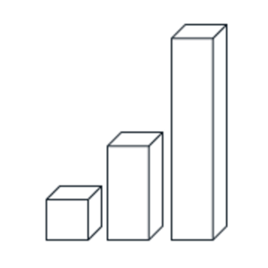
The basic representation of growth is usually shown with an upward-sloping line or bar chart. The image below was our starting point, a simple and elegant depiction of growth. It also pays homage to a logo of a company founded by a party we have been fortunate to be acquainted with and greatly admire but that’s a story for another time.

We deliver this growth following a fundamental bottom-up process but this process is delivered by leveraging a variety of modern approaches. These modern approaches allow for repeatability, transparency and scalability, enabling us to consider multiple dimensions of an investment opportunity.

We represent our growth with an even simpler bar chart, with lines doubling in each subsequent time period. Viewed in 3D, it looks like this:

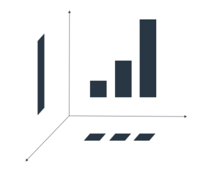
This chart can then be viewed from three different dimensions: front, top and right. The front view is still the very familiar representation of an upward-sloping bar chart:


Top view, however, looks as no growth, a flatline return, perhaps three coupon payments of a bond, or an annuity:


The right view looks like a one-off payment (call it a lump sum, a one-trick pony), hiding all the detail away from perspective:

Putting it all together in the on a x, y, z axis produces the following projections on the respective planes:

Now, if you were to stand a cube on a diagonal so that it is perpendicular to our viewing plane – you will see the outline of a hexagon. Overlaying the three projections from above on the relevant planes allows you to come up with Quantworth’s logo:


It is an image that to us speaks about multiple viewpoints being brought together to generate one complete picture. As investors, we look for attractive investment opportunities through a fundamental bottom-up process.

We accomplish this goal by leveraging modern tools, cutting-edge technology hosted securely in the cloud.

We all have our own tales about ‘work,’ don’t we? For most of us, that word might conjure images of ticker tapes and ticking clocks, endless spreadsheets, or maybe a boss with an uncanny ability to appear just when we’re sneaking in a social media break. But today, let’s toss aside those run-of-the-mill ideas and delve into a different kind of work – the kind that deals with energy and motion, as defined by physics.

Now, don’t let your eyes glaze over. We’ll make it as plain as pie. Think about something as simple as moving from your desk to fetch another much-needed cup of coffee, or making the trek from your comfy couch to your office. By just walking, you and I burn about 100 calories for every mile covered. But here’s a funny twist – we’d burn more if we decided to run that same distance, despite doing the exact same amount of ‘work.’ Doesn’t quite add up, does it? Blame it on our bodies being a little less efficient when we’re huffing and puffing.

Now, what if we brought a bicycle into the mix? Our calorie burn plummets to roughly 20 per mile. That’s five times more efficient! And if we chose to ride downhill, we’d be cruising along almost for free. Hop into a car, and things get even more interesting, though we’d start burning more than just our breakfast.

So, this gets us thinking: Could we apply this kind of efficiency leap to something like investing? And, more importantly, should we? Well, folks, the answer to both those questions is a hearty ‘Yes!’

Moreover, the industry must do so or perish!
Read more